Helping people to be life-long learners
Learning is traditionally thought to be the domain of youths. Once inside the professional life, people hardly find time to learn in their free time.
What if we could help everyone to be a life-long learner?
What is Koober?
Through applicable abstracts, the app allows people to understand the best of non-fiction books. Koober's vision is to inspire people to progress.
Challenge
Learning is an effort, just like when going to the gym or doing a diet. You know it's good for you, but you'd rather stay home and chill.
What I discovered during user-tests is that browsing the app to choose a book was also an effort. We couldn't ask for double-effort, we needed to fix the app so that people could focus their energy on what matters to them: progress.
The "gym" metaphor was a great empathy tool to communicate the challenge to the other teams.
2017
Team
I was working in a duo with the iOS Developer, including him in design decisions right from the beginning.
I was also discussing with the CEO, the content team and the growth team as I believe UX needs to take into account all the disciplines.
Role
As the only designer on the team, I did the User Research, UX Design and UI Design of the new app. I redesigned the app, simplifying the entire architecture and access to content.
Research
Objective: continuous research → 5 user calls per week + 1 user-test per week
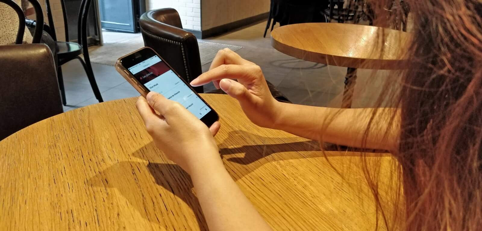
Story of one user test
When I met a user over coffee, she told me before leaving:
— I'm going to read a new book on my way home.
— Can you show me how you are going to do that?
— Sure, let me find something interesting to read.
~~~
After browsing for a moment in the app:
— Actually, this is too painful. I couldn't find something that caught my attention. I'm changing my mind, I'll listen to music instead.
Lessons learned
🎷
🎷
Koober is competing against music and other ways of distraction during commuting.
🚃
🚃
The commute is the perfect time of day where Koober can fit. Keeping the articles concise is therefore essential.
🔍
🔍
Discovering new books with the app is too painful.
Strategy
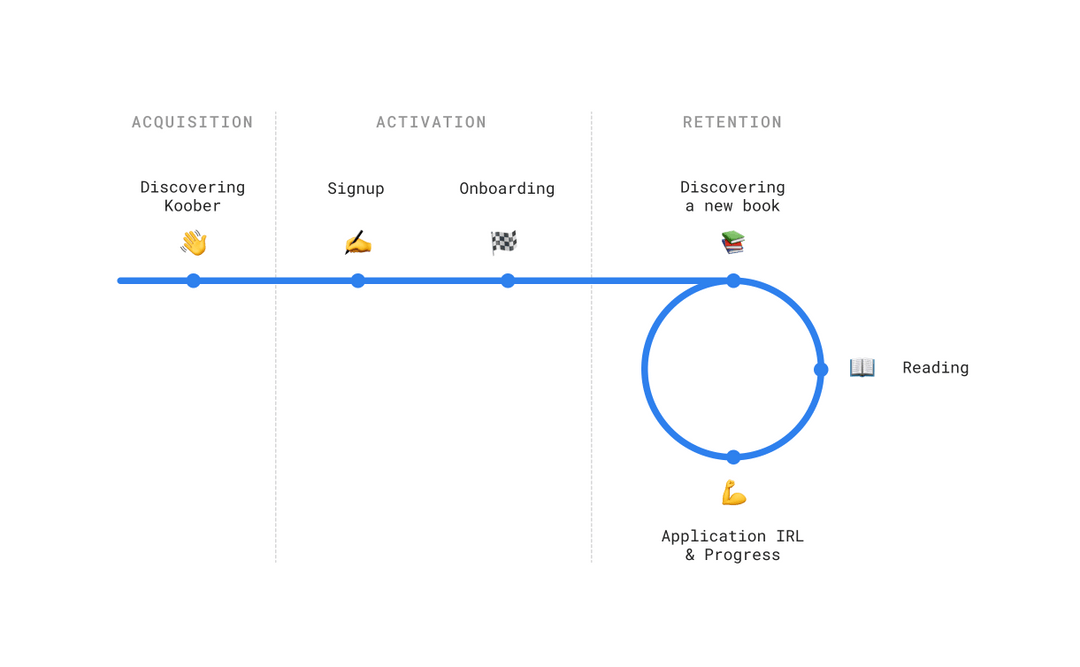
After mapping the experience we could identify a crucial point in the Retention loop:
The goal isn't to have people read as much as possible. This would cut off the loop and flood people's mind with overwhelming info. Eventually, it will result in no actual application. This goes against Koober's vision which is to help people grow.
Instead, we have to help people complete the full loop as fast as possible. To do so, we chose to tackle the Discover step to start off.
Solution
Before
Architecture
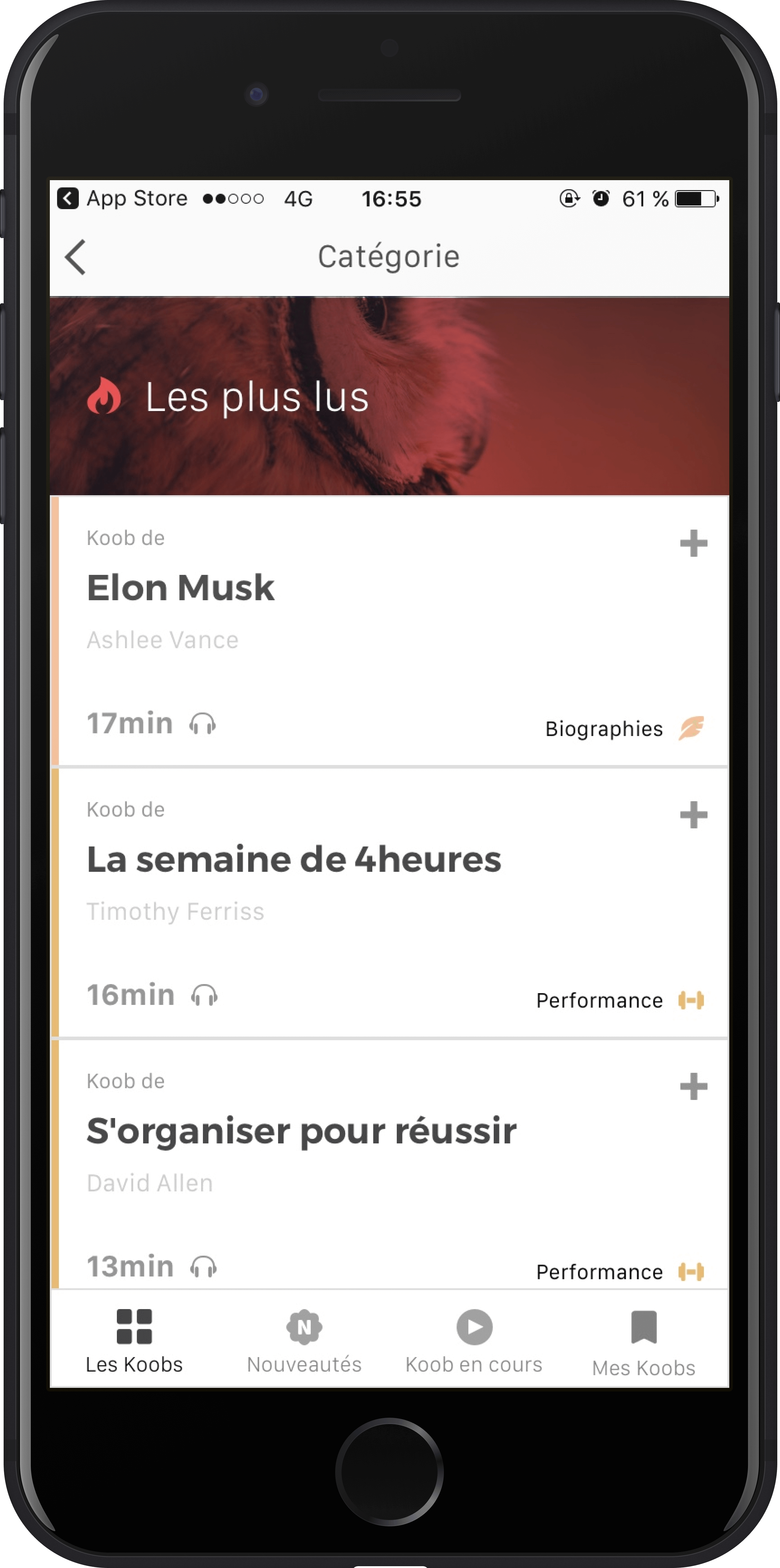
The previous interface was asking people to first choose a category, which was creating silos.
Decision process
They then landed on a book list with no other clue, other than its title, to make their choice. The app was not helping users to figure out whether the book was right for them, which induced a high cognitive load.
Silos + obscure content result in frustration for the users, who are going back and forth between 3 levels (Category – Book list – Book presentation screens). Discovering and choosing a new book was perceived as a cumbersome experience.
After
Architecture
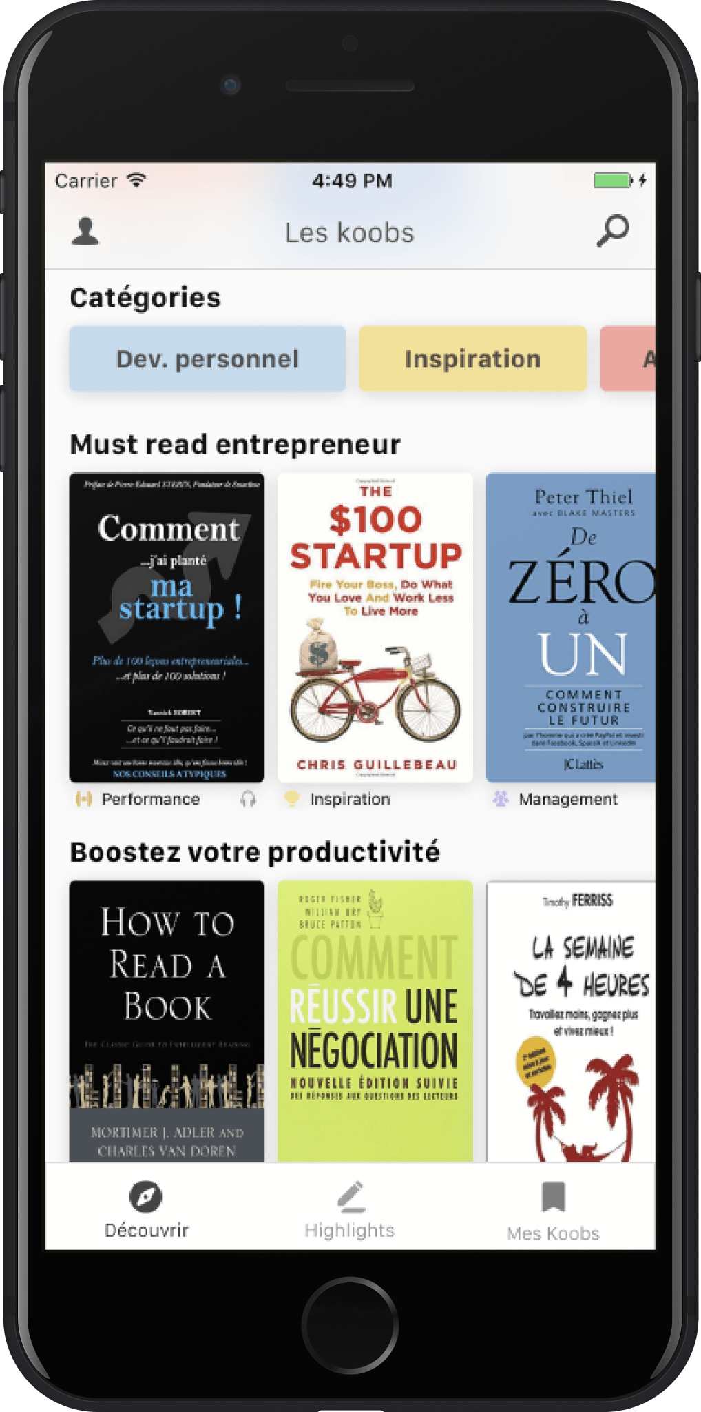
In the new app, the content is shown upfront and reorganized into specific themes.
Decision process
To better help users decide, the collections' topics are meant to reflect the challenges they might be facing in their own lives. Adding book covers is an essential visual clue that helps reduce the cognitive load while being visually entertaining.
I also simplified the app architecture: this allowed us to go from 4 to 3 items in the navigation bar.
Symplifying the architecture
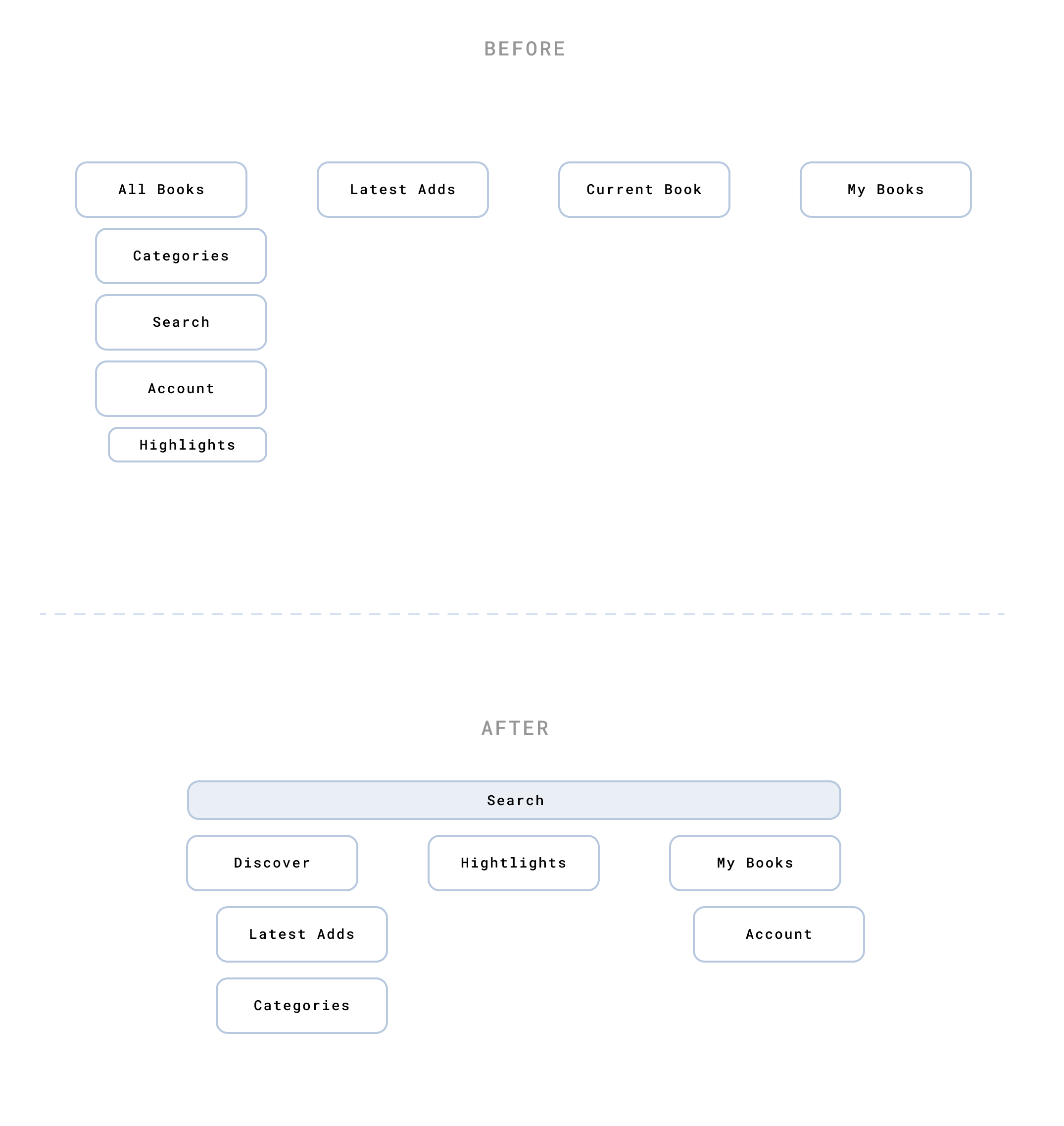
Before
‣ The word books was written 3 different times in navbar. Repeating words makes it harder to mentally separate sections
‣ People couldn't find the Highlights feature, even though it's an important part of the experience, especially to remember and apply in real life
‣ Latest Adds and Current Book were not often used. To discover new books people would go in All Books. To resume reading a book they would go to My Books
After
‣ Merge All Books and Latest Adds and name it Discover, creating a single point of entry.
‣ Display the Search on every screen. In My Books, users can look for a book more easily if they have a long list
‣ Put Highlights in the navbar to make it part of the experience. It helps with assimilation of content, which is essential to learning and applying in real life
‣ Suppress Current Book and make it part of My books using a default sort by last read
The solution took into account the limited resources of an early-stage startup. The UI could be broken down into components, which were easy to build for the developer, and easy to manage for the content team.
© 2021