Matching the mental model of moving to a new home
Moving is an exciting new step in people’s lives but is spoiled by many obstacles: overwhelming paperwork, financial stress, careless movers, etc.
2018
Challenge
My client approached me with a rough prototype. My goal was to simplify it while ensuring a good conversion on each step.
We will focus here on the most challenging part of the funnel: adding your inventory.
Team
I teamed up with a freelance developer and the client. We took the decisions together and followed the entire project to minimize handoff.
Role
I did the user-research, product strategy and designed the product & homepage.
Research
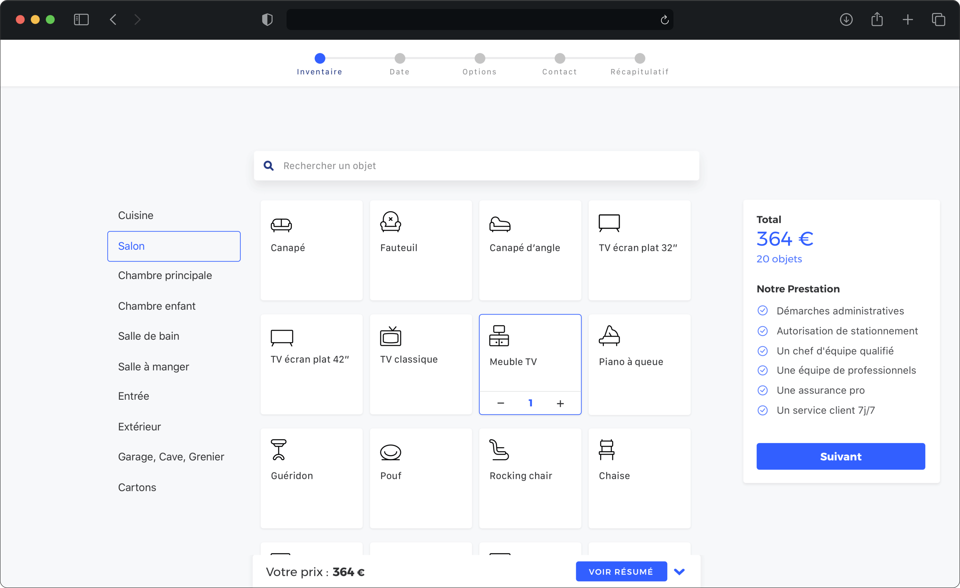
Mental model: room by room
User research helped me identify the user’s mental model: if you give someone a pen and ask him to note down the objects he needs to move in his new home, he will naturally note them down room by room. This is not their competitors' approach which relies only on Search.
Anticipating user needs to create acquisition and loyalty
User research also helped me to define a differentiating product strategy for the company.
I showed my client how to think around the product — covering the entire User Journey and anticipating needs before and after the product.
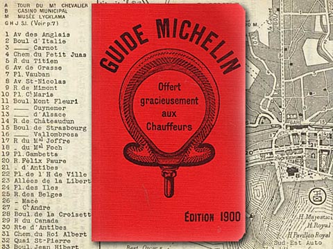
For confidentiality reasons, I cannot disclose the strategy, but I will give you another example of thinking around your product: the Michelin guide.
You might know the food guide, but they're originally a tire company. They started the guide to help drivers in the 1900's to drive around and use up their tires. It was filled with handy information such as maps, gas stations, hotels and restaurants.
There seems to be quite a gap between the guide and tires, but everything clicks when you consider they were caring about their user's journey and included everything needed for a smooth trip.

And here's a personal example: one of my other clients is creating a new kind of technology. While technology is clear for developers, they might need to convince their hierarchy that it is the best choice. While doing so, they might face a language barrier.
The question becomes: how might we help them to communicate the technology's advantages in a way that resonates with the listener?
We could do the greatest product, the technology's growth will be slowed down if the developers are not able to convince their hierarchy. This has to be designed as well.
Solution
Matching user's mental model
As discovered in the research, people think of their places in rooms (or zones if it's a one-room studio), my job was to translate this mental model in the design. After different explorations, we opted for a sidebar, which performed best in user-testing.
Powerful and versatile search
For quick access, the search looks up across categories. By allowing both use-cases, we offered more flexibility to users.
Adding your own object to the list
When searching, the last result offers you to create your own: this way, this feature shows up in context. The strategy was to put people in a position of consumption instead of creation, which requires less effort.
Double-checking? Yes, please.
Before confirming the order, people would need an easy way to double-check everything is okay. To help people do that, I added an overview list that keeps the room by room model.
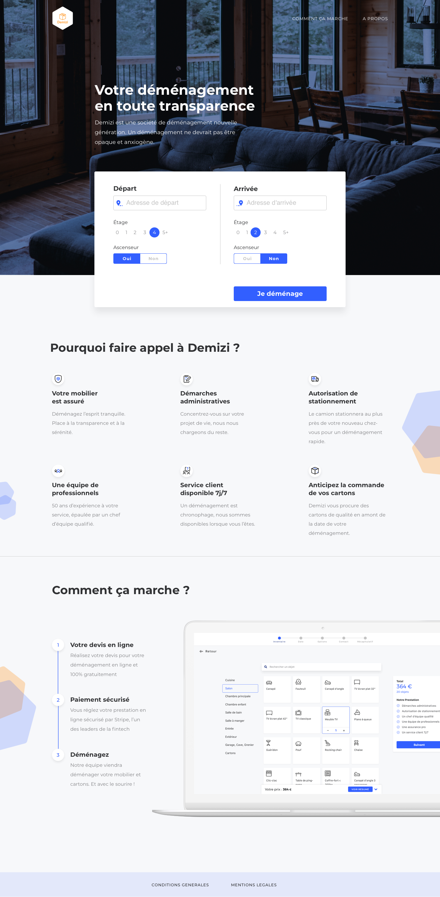
Homepage design

© 2021
