How to build trust during onboarding
Setting up a password manager can feel like dealing with a cold machine. What if we could make it feel more human?

Let's start with a story
We were interviewing a young mom. The dad wasn't part of the test and was taking care of the baby. Something unexpected happened, the mom turned over and said to her husband:

— Weren't you using a password app too?
— Yes, I'm using a password manager at work for the bank. I also have one for personal use on my phone, but I didn't mention this one to you.
— Why not?
— Well... I know you wouldn't be able to handle it.
— What do you mean?
— I know it's not your thing, you would find it too complicated.
— Are you sure? What's the name?
— Let me check...
The dad pulls out his phone and opens a group:
— Here! Dashlane.
— Isn't that you guys?
At this point, we wanted the earth to swallow us whole.
But it slapped our assumptions in the face and allowed us to tackle the problem. Here's what we came up with:
Results
Results
Results
7.3%
lift in retention
99.92%
probability of being better than control
So, how did we do it?
First, some context
Dashlane is
a password manager
$211 million raised
Our brains were not built to remember passwords. Most of us end up reusing the same password or pattern over and over — which means a hacker could potentially get access to all of our accounts.
Dashlane can create unique passwords, store them securely, and type them automatically for us.
2020
Team
I worked in a cross-functional team at Dashlane:
1 design manager
2 product managers
2 data scientists
1 QA analyst
1 UX writer
2 developers (iOS & Android)
1 user researcher
1 product designer (myself)
Role
I participated closely in the UX Research, then communicated it with our team.
Using these findings, I organized brainstormings with the entire team. The goal was to make everyone feel involved in solving people's needs.
I designed and user-tested the flow with our UX writer.
We needed to find out why the couple felt this way.
Defining the problem
It turned out that the Dad felt like it was part of his identity.
His hobbies are quite technical and he likes to take time to set up this kind of stuff at home.
But his wife enjoyed getting value out of the box.
Her focus was on getting the outcome without having to deal with the technicality.
Current onboarding flow
Works for the Dad, not for the Mom
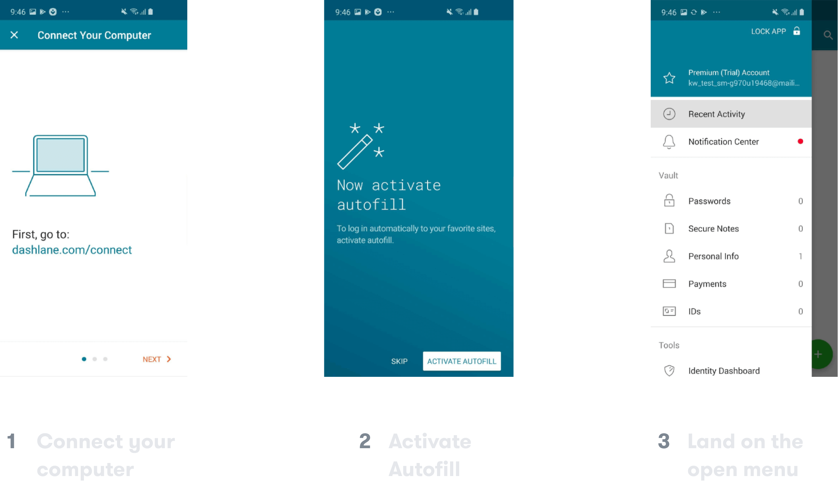
Screen 1 and 2 are focused on Dashlane needs
Rather than what people need. This happens even before even entering the app.
Screen 3 leaves people on their own
When finally landing in the app, people were left with no guidance and no sense of progress.
We knew we needed to give value as early as possible. The onboarding shouldn't be about what the system needs from people — but about how it can help them solve their problems.
✗ We wouldn't feel like we're making any progress if a doctor told us right away:
✗ We wouldn't feel like we're making any progress if a doctor told us right away:
I need your social security number. And I don't accept credit cards.
✓ Instead, questions like this makes us feel welcomed and understood:
✓ Instead, questions like this makes us feel welcomed and understood:
What brings you here? What kind of symptoms appeared?
With our UX researcher, we created the documents below to easily share our findings with the different stakeholders.
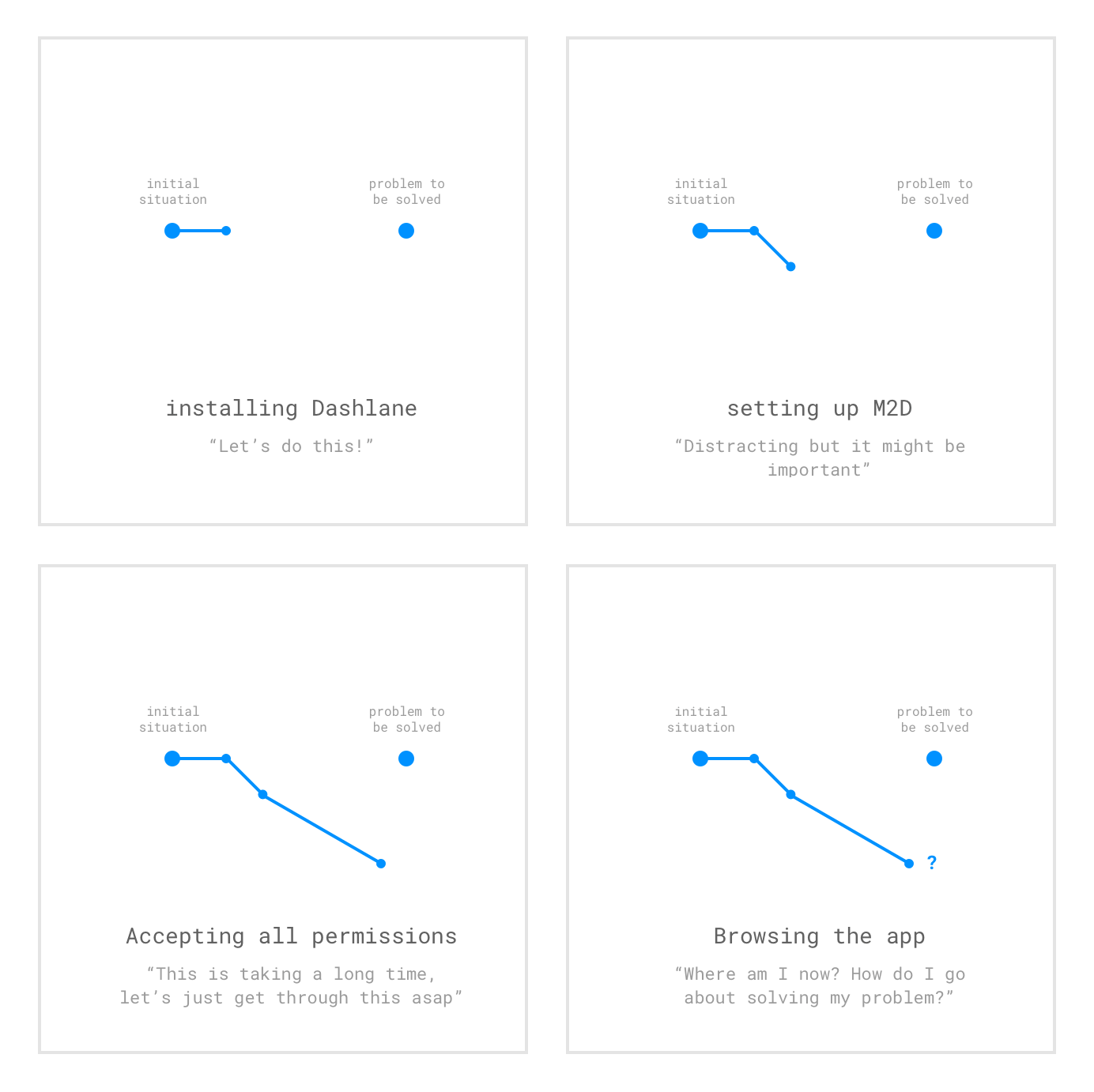
The two islands metaphor
How the Mom feels after the onboarding
The island on the left represents the Mom's current situation, the island on the right is the situation she wants to be in.
She starts swimming towards the second island. But on the way, the onboarding distracts her with questions about setting up the system. Once done, she is left on her own in the middle of the ocean, clueless about how to reach the island.
It's as if an airline would ask for your credit card number and passport first, to then tell you:
« Sorry, we actually don't fly to Tokyo! »
Mental model research
Finding out patterns
After using a product, we naturally develop a mental image of how it works. We asked people to draw that image for Dashlane.
We found some patterns in the drawings that allowed us to build the mental model.
We were careful to ask Dashlane users and non-users to see if there was a gap.
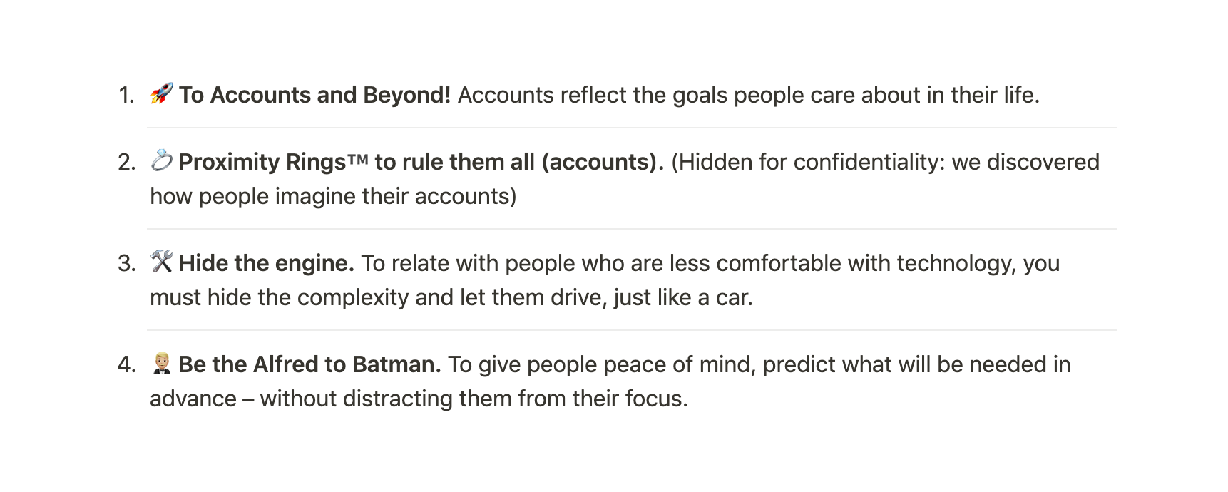
These findings informed our solution
We created a one-pager you could refer to during the design process.
Each point was built as a fun slogan to make them memorable.
Building a united team
Our 3 psychological focuses
Guidance
Leading people on the best path for them
Reassurance
Showing people we can help them before they commit
Closure
Letting people know when Dashlane is set up and let them go about their day
Using a doctor metaphor as a vision
How could we create trust the same way a doctor does it with his patients?
This metaphor was our inspiration and a good communication tool within Dashlane: people immediately grasped what we were trying to do.
Going out of the building to create empathy
Some of the team members went to user interviews with our UX researcher and had similar "slap-in-the-face" experiences. I also shared a clip of a user interview with the rest of the team.
We also opened the perspectives — getting away from tech — by adding inspirations from  Japanese hospitality (Omotenashi) and from
  Pixar's storytelling principles.
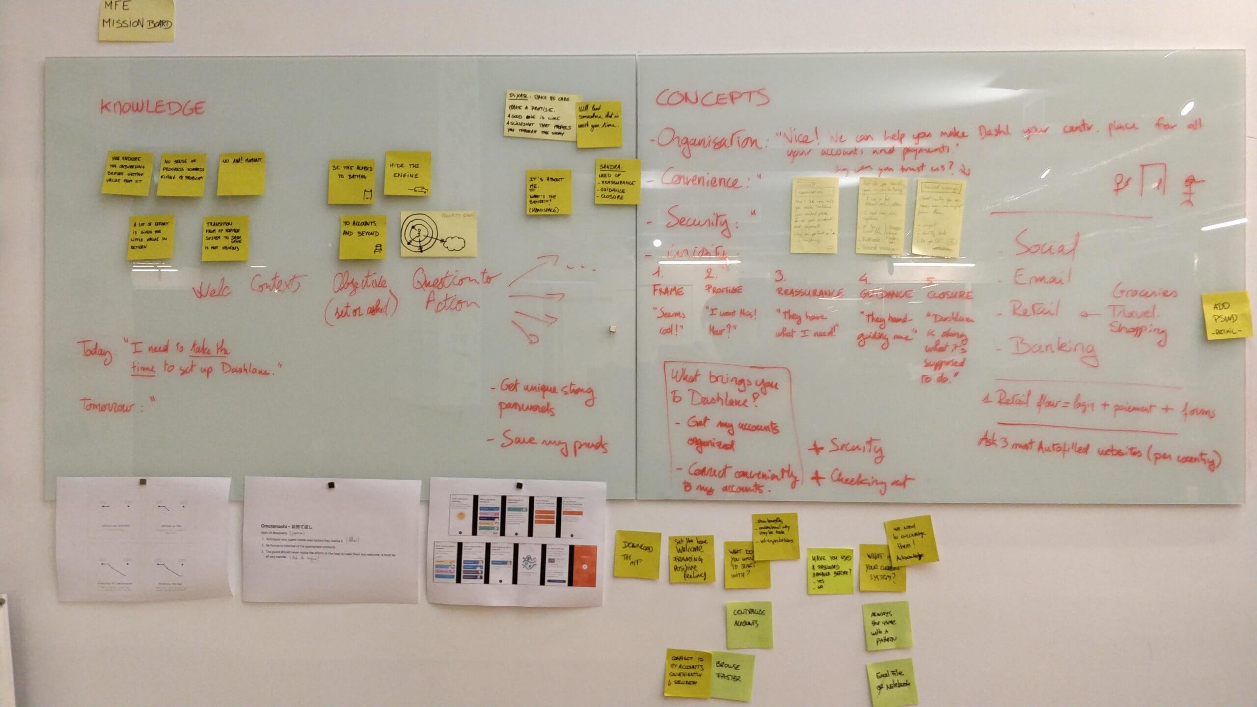
Brainstorming
Everyone is involved from the beginning
PMs, Developers, UX Writers, Data analysts, User Researchers were involved to build the concept. Building the concept together was key in uniting the team: we had a common problem to solve.
This got the devs to be willing to go the extra mile
‣ That happened because they were building the concepts with us — and as a result, wanted to give the best experience to people as possible.
‣ In contrast, they told me that when they didn't work on the user problem they were usually handed off the solution at the last moment — thus, under time pressure, they would stay in what they knew, they no longer had the time to push their skills.
Solution
Switching the focus from Dashlane to People
Welcoming people
It's not about us, it's about them
Instead of showing system requirements, we start by asking simple questions. Our goal was to make people feel like they are moving towards solving their problem.
Getting set up
Each card was built as a tiny landing page
The personal plan is designed to make you feel like you're walking on a safe path. When you're done with it, you know that Dashlane is doing what it is supposed to do.
Header ‣ main benefit
Button ‣ clear call-to-action that complements the header (the two together should be self-sufficient)
Subheader ‣ clarification if needed
Animation ‣ helps to picture the benefit and it helps to build the mental model
Defusing anxieties
Building trust with the right timing
This section was very appreciated during our user-tests. When people try Dashlane, there are always 2 main concerns:
‣ What if Dashlane is hacked?
‣ What if Dashlane is hacked?
‣ I'm afraid of putting all my password in one place
We made sure to address those. For instance, it was often surprising to people that Dashlane cannot see their passwords.
✗ We didn't place this section on the first page. How would you feel if a doctor told you right away:
✗ We wouldn't feel like we're making any progress if a doctor told us right away:
I've never hurt anyone and here are my diplomas.
✓ Suspicious, right? We made sure the first two screens would be dedicated to getting to know you — just like a doctor would ask:
✓ Instead, questions like this makes us feel welcomed and understood:
What brings you here? When have these symptoms appeared?
An iterative process
It took us some time to land on sometimes we were satisfied with. Many user-tests and rounds of feedback were necessary.
Results
It paid off
During user-tests
100%
felt their expectations were excedeed
« It's more friendly than what I thought it would be »
90%
felt motivated to continue with the app
« I'm going to check out this app after this test! »
100%
felt guided
« I feel like this app cares about me »
After launch
7.3%
lift in retention
99.92%
probability of being better than control
© 2021